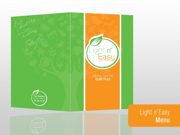
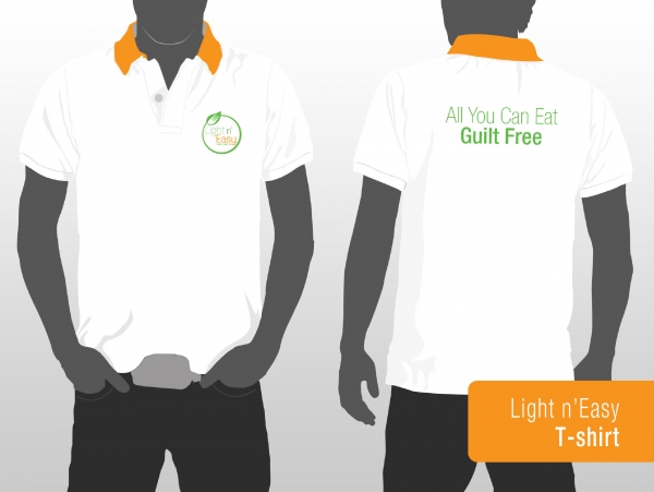
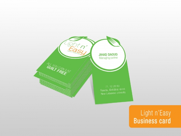
Light n’ easy is an organic and healthy food restaurant.
The logo design is formed from a green circle and a green tree leave that indicate nature which is a symbol of health, in addition to the fork that represent the restaurant.for the colors we used: green that shows healthy life and orange that shows energy.
February 24, 2015
Graphic Design